University of Southern California
CSCI 588 Specifications and Design of User Interface Software
Assignment 2 (WeiHung Liu) Due: Monday, June 8, 2015
1. Assignment Subject
User interface Design Analysis based on Eight Golden Rules of interface design
2. Bad Design Study Case
Snapchat iOS App
2.1 Eight Golden Rule 1 - strive for consistency


Bad Consistency of Apperances and Termiology: Overview all 4 scenes, we call get that not
both of them has the same navigation bar(at the top) or navigation tab(normally at the
bottom). On top of that, they have different color and font in each separate scene. In
addition, they don;t have identical terminology for the title. Sometimes it is a noun and
sometimes it is a verb.
Suggestions to fix: First, use the same font and font size on top of every single scene. Second, as for top navigation bar, it can either use opaque same background color or transparent background as long as with same color icon on two sides(top-left and top-right). Third, try to unify the terminology of the scene title.
2.2 Eight Golden Rule 2 - cater to universal usability
As far as we know, the target user group of snapchat are college students and snapchat
doesn’t provide any incentive or content for those who are more young or elder. Also, In addition, snapchat only support English version.
Suggestions to fix : first of all ,they can provide short animation or short cartoon video to attract younger users and second, design more understandable user interface for the elder to use it.
2.3 Eight Golden Rule 3 - offer informative feedback

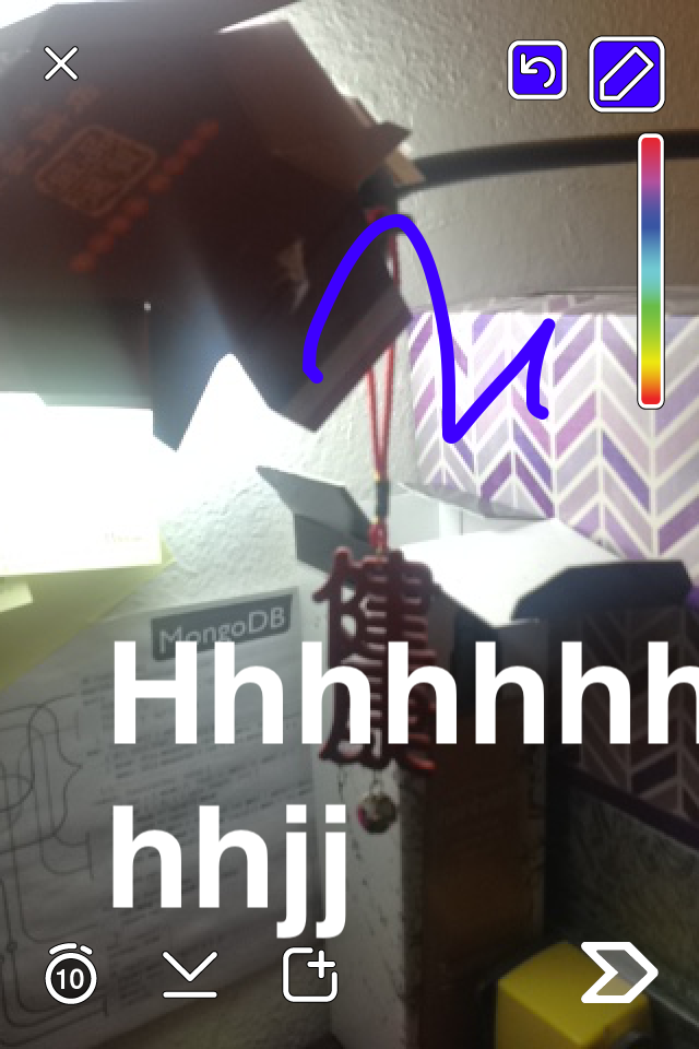

Bad informative feedback of photo/video sent successfully. When we take a photo, the
screen stop right there and have a intention to let add any filter or text onto photo you just took (see the above left figure). It’s hard to know what is next after taking photo.
Suggestions to fix: So at least every icon should have a hover explanation small tag to let user know what’s going on here. And furthermore, add a small animation text on arrow button to let user know how to proceed to next.
Bad informative feedback of home screen - when log into snapchat, your first launch screen will be image taker view and some small icons. It’s really hard to know how to use it in the very first place.
Suggestions to fix: First, snapchat can shot a small video regarding to how to take a photo, add some overlay on it, and how to send out to your friends. Second, they can put a “Question mark” icon on the home screen at any corner to let user hit and learn how to use it.
2.4 Eight Golden Rule 4 - design dialogs to yield closure

Bad design of yield disclosure: After sending out the photo on the “Send To” scene (the
above left figure), the system will automatically take users to “sanpchat” scene and show your time on top of row. Therefore, it is hard to know you send out successfully or not, there is no clear disclosure like a short HUD pop up to let you know photo sent successfully.
Suggestions to fix: to design a alert view pop up or a small HUD(heads up display) fade in to let user know they already send out a photo successfully. Or use three empty arrow with text(number) inside at first to indicate which step you are on and when user finish all the steps at final, all three arrows should be filled with color.
2.5 Eight Golden Rule 5 - prevent errors
Bad error prevention of the network connection problem - when cell phone is switched into airplane mode or getting into bad network connection area, functionality of photo taking and sending out still works and show the failure of until users already carried out all the work
in vain.
Suggestions to fix: For the network connection problem, system should detect and give a informative feedback in the first place when user try to take photo under bad network connection.
2.6 Eight Golden Rule 6 - permit easy reversal of actions
Bad design of undo text writing - As shown in the above figure, color pen provide a easy
reversal of action by clicking the reverse icon. However, for the text undo, they don;t provide
such a handy icon. Instead, user need to tap the text label and backward delete all the
characters in the text label.
Suggestions to fix: They can use the same logic of restoring the drawing of color pencil by showing up ‘restore icon’ right after user finish adding text on the photo.
2.7 Eight Golden Rule 7 - support internal locus of control


Bad design on support internal locus of control: when user finish posts, it’s good to know what their posts look like. And It’s also better to know what you already posted so far, that said, a post history. Inspecting all user related screen and not be able to find any of it.
Suggestions to fix: they can put all posts of user themselves in the first row of activity screen in a collapse mode and provide a button to expand to review them.
2.8 Eight Golden Rule 8 - reduce short-term memory load
Bad design on reduce short-term memory load: From the above two figures, we can see that there are plenty of icons instead of text buttons.
Suggestions to fix : They can add a tag tooltip(a button function explanation) on every single icon. When user touch the screen, these tags will show for a short period indicate their respective functionality.
3. Good Design Study Case
Gmail
3.1 Eight Golden Rule 1 - strive for consistency


Good consistency of apperance: Gmail keep the same side bar and top tool bar whatever you open what category of message. These two bar provide the functionality to let user can always go back, refresh, edit, trash or add some notation on your mail.
3.2 Eight Golden Rule 2 - cater to universal usability


Good universal usability: for the compose button, it is big and notable. It’s very easy for all kinds of user to notify and compose the mail. In addition, the composing area is also expandable for bigger view which is very suitable for the elder. By the way, gmail also provide multiple language support to benefit all the people have different languages.
3.3 Eight Golden Rule 3 - offer informative feedback
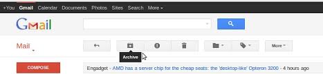
Good informative feedback on button functionality: gmail provide a tooltip to explain the basic functionality for every button/icon when user hover the button/icon

Good informative feedback on status: gmail will let you know how is your progress of your email sent out. Also they provide a ‘view message’ to let you view what your mail looks like right away.
3.4 Eight Golden Rule 4 - design dialogs to yield closure
Good small dialogs to yield disclosure: gmail provide a small dialogs to let user know they finish the process of writng the message and sent out successfully.

Good small dialogs to yield disclosure: for those unfinished email, gmail give a red text “draft” to let user know they are in the middle of process on writing an email and not yet finished.
3.5 Eight Golden Rule 5 - prevent errors

Good confirm dialog to prevent error: Gmail will confirm with the user the action of delete message is correct or just a false alarm to prevent the error of deleting wrong message or flase clicking the button.

Good failure warning: Gmail would pop up a dialog to let user know their message was encounting a error and not being sent.
3.6 Eight Golden Rule 6 - permit easy reversal of actions

Good reversal of actions - Gmail will give the user the right to restore the deleted email to prevent some mistakes. In addition, after getting into each email, Gmail also provide go back button to let users go back to previous inbox or emails of collection. It is pretty useful since sometimes we are checking mail by mail to find some interested information and need to go back and forth.
3.7 Eight Golden Rule 7 - support internal locus of control
Good layout control: gmail provide customized layout control for user to design their email apperance.
Good email attribute control: There is a small icon upfront every message allowing user to mark their message with different color or tag to take a notation.
3.8 Eight Golden Rule 8 - reduce short-term memory load

Gmail provide a tooltip(short text explanation) for every button/icon, so user has no need to remember what every button/icon is supposed to mean.
Gmail provide a powerful search bar to search any keyword within your email, so users doesn’t have to remember the content of every email.